
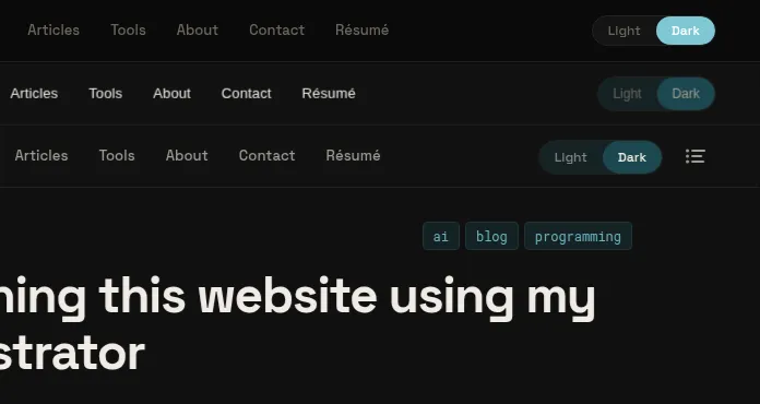
tl;dr
- Betteridge's law of headlines says "no"
- My orchestrator wrote ~10k lines autonomously; and I directed agents to touch up another ~10k
- The breakdown of lines modified during this whole project was 49% automated AI, 13% bugs / drift fixes, 27% planning gaps, and 11% taste / tweaking.
- I don't think it's possible today to one-shot any non-trivial project, despite many claiming otherwise
I just refactored my whole website into a completely new design without writing any code myself. Looks pretty good, right? Would you believe me if I told you I one-shot this whole thing in one day using my AI orchestrated workflow? No? Good, you shouldn’t because I didn’t. It’s hard to believe given all the AI hype and hyperbole spreading on social media that entire applications are being one-shot by agents that are left to run on their own for hours or days. Let me show you how the process goes in reality for any non-trivial project.
The process
To begin with, most one-shot narratives hide what comes before implementation even begins: an extensive planning process.
To start, I made HTML mockups with Claude’s web interface for the key pages: homepage, blog post, tags page. These served as visual targets and required me to collaborate with Claude over several iterations.
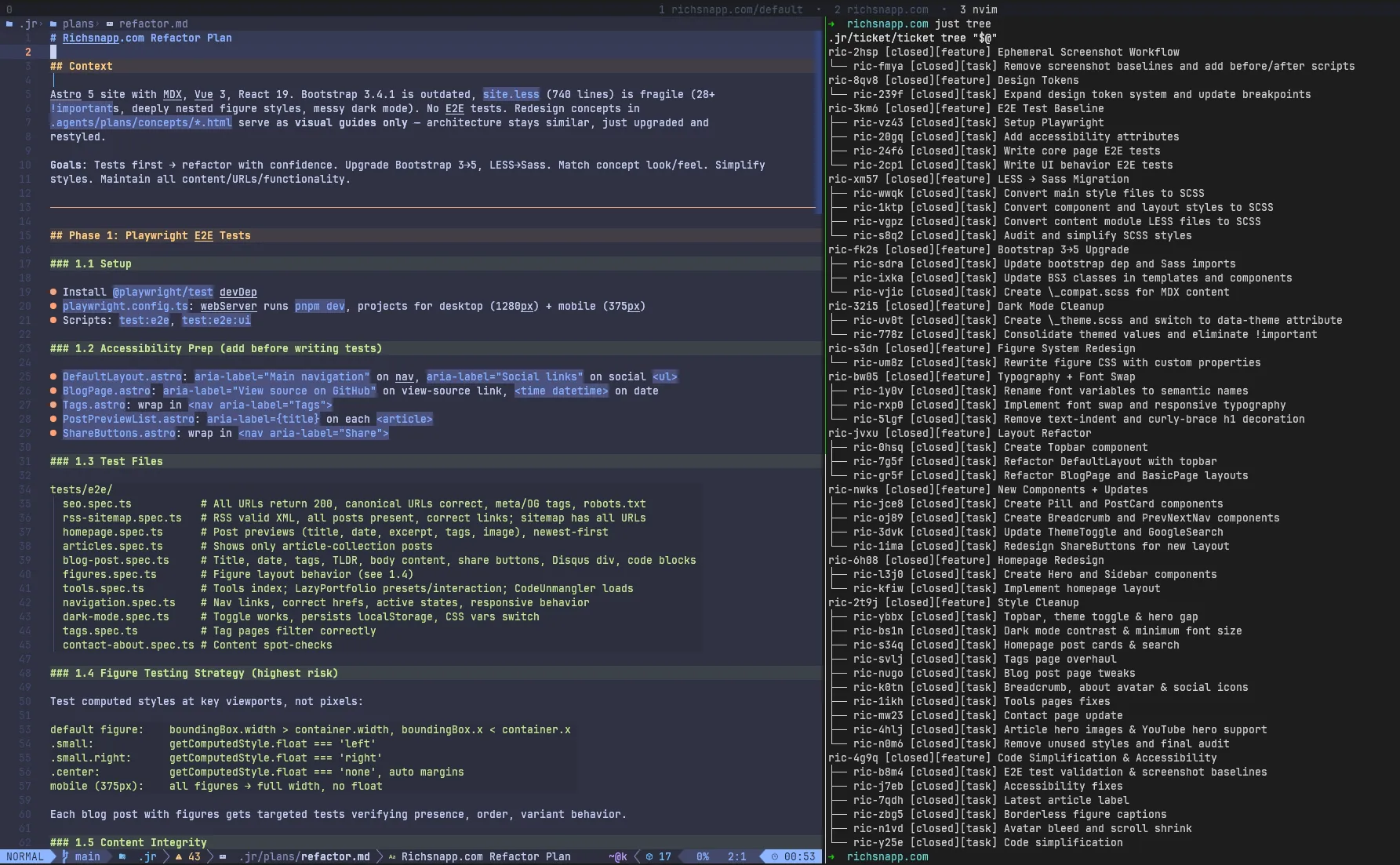
Later, I wrote a detailed refactor plan covering tests, migrations, layout, and components. I had
/jr:plan-features break this
initial plan and the concepts into 11 features with 30+ tasks in dependency order - E2E tests first as a safety net,
then library and framework migrations, then visual changes. That’s all human work upfront before a single autonomous
commit landed.
The narrative also hides what happened after. Each feature ran through multiple iterations of a coding agent, a code
reviewing agent, and an architecture reviewing agent… and even with that rigorous autonomous process 5 of 9 features,
after the architect signed off, had to be rejected with feedback and run back through the implementation loop: broken
pages on /about and /tools/code-unmangler (Layout Refactor), code-figure backgrounds that didn’t match (Design
Tokens, sent back twice), figures with broken borders and missing bleed across multiple articles (Figure System, sent
back twice).
In addition, two more feature loops were added after the initial set of features to account for code bloat and
accessibility issues missed during the initial implementation (similar to a /simplify round suggested by Anthropic
themselves). A dead-click area on the theme toggle plus six other issues bundled together (Style Cleanup), avatar sizing
wrong on tools pages (Code Simplification). Without a human (me) catching these problems the final product would have
drifted significantly farther from what I finally shipped. The reviewing agents caught some things but many other things
were left for me to find.
What follows is a walk through the key moments of this redesign - what the orchestrator handled, where the plan fell short, where my own taste needed to take over, and where the automated process introduced bugs that I had to correct with a turn of thoughtful feedback.
Static HTML mockups built by hand in Claude’s web interface. Color system, typography, component structure, layout grid. Agents referenced specific line numbers in these files when implementing components. The concepts were explicitly visual guides that captured what the site should look like but couldn’t convey the entire UX, and they weren’t an implementable spec - but they were a good place to get started.
/jr:plan-features decomposed an initial planning session into 11 features with dependencies. E2E tests first, library
upgrades (LESS→Sass, Bootstrap 3→5, dark mode cleanup), then visual changes (figures, typography, layout, components,
homepage). Two more features - Style Cleanup and Code Simplification - were added later to cover gaps in planning (you
never get everything right up front).
The homepage was the kind of win that the one-shot narrative is built on. Coder and reviewer agents completed thousands of lines across two tasks in one feature in about 30 minutes, fully autonomously. The coder independently recognized that DefaultLayout’s content wrapper would block the full-width hero and created a separate HomeLayout. Genuinely good autonomous architectural work within Astro that I was just able to accept as-is.
This is what people highlight when they talk about one-shotting a project. However, this was just one segment of a much larger process and even comparing with the concept above you’ll see some divergence.
As you can see, it took tens of more commits to get the homepage styling and CSS to production quality. Hero padding, avatar position, tweaking the eyebrow across breakpoints (across breakpoints is where most issues seemed to crop up), preview image sizing, figcaption colors, sidebar search button colors, spacing, and a ton of tweaks to the light/dark mode.
Nothing intellectually difficult, but none of it autonomously by the orchestrator. Each tweak was a specific instruction from me to an agent: fix this exact thing. The structure took 30 minutes; getting from structure to shippable took me directing fixes one at a time.
This was the biggest planning gap: the Table of Contents. Seven commits, ~850 lines added, integrated into both the sidebar and the mobile hamburger menu. It wasn’t in any plan, concept, or ticket mainly because my original site didn’t even have one. But the redesign moved primary navigation from a sidebar running down the right margin into the topbar and all of my figures had been designed to avoid that sidebar space… It was now empty and something felt missing.
A Table of Contents for my long-form articles seemed to be an obvious use for that space (although probably not obvious to an agent), but planning for this before implementation was not obvious because the need only emerged when I saw the finished layout with my actual content.
Other gaps: this Steps component you’re reading this content in right now (nine commits to build), swapping Font Awesome for astro-icons, and an Astro framework upgrade so that I could use its new fonts API. None of these were in the original plan, but all of them were important pieces of the final result.
The concept’s topbar was 52 lines of CSS - a static mockup with no hamburger menu, poor responsive behavior (especially in mobile), and no avatars (a personal touch). The shipped Topbar component is 757 lines. The gap between “visual guide” and “implementable spec” was enormous, and the agents could only bridge the structural part of it.
Trying to get the orchestrator to match the concept exactly was painful (but who among us has never pushed back against a designer asking for pixel-perfection?)… Enough so that I gave up and took what came out and then refined from there.
Final refinement is taste work, and taste work is where one-shot claims fall apart fastest: there is no spec that can match exact desired look and UX, it’s an iterative process that builds upon itself… If it could be perfectly defined in a spec it would be code and you would be done as soon as it was written.
The implementation of my complex figures into the new redesign had the most back-and-forth thrashing between agents. Five total review rounds before merging - the architect itself caught issues on two of them, approved on two more that I then had to reject, then a final approval. Round one it approved with “0 significant gaps” and I immediately found four visual bugs. Even after all five rounds, nine more fix commits followed post-merge.
The most painful was a 4-line CSS change for astro-island wrapper elements breaking child selectors with an injected
<style> tag. Hours of debugging for four lines because no agents were cluing into the fact that this was an actual
bug.
Perhaps Opus 4.7, with its improved vision, will help out here in the future.
The ThemeToggle took three separate commits to fix. The agents restyled it per the concept, but accessibility requirements (contrast ratios, focus states) kept conflicting with the visual design. Each fix regressed the other direction. The root issue: the concept itself wasn’t contrast-appropriate, nor was it functional, so the agents were working toward a target that was inherently inaccessible and incomplete.
The Bootstrap 3 to 5 upgrade had a similar pattern - three automated actors all approved without noticing that different default breakpoint pixel values broke container widths across the entire site.
I came up with a structure for before/after screenshot tests that I would recommend to anyone doing frontend work with
agents. A test suite that generates screenshots for every page at every breakpoint and runs with a before and after
command to do before/after any significant change that could generate regressions.
While the agents themselves are not very good at deciphering what broke from screenshot tests, humans are quite good at spotting visual differences and determining if they are intended or not.
I would run pnpm run test:screenshots:before before I had agents do something, and then run
pnpm run test:screenshots:after after they did it to determine if they had done what I had asked, and most
importantly, had they done it without visually breaking something else in the process.
I tried to do automated screenshot tests with the agents and I would call it a failed experiment. They ran the tests, then waded through hundreds of near-identical visual changes and hallucinated as to what the cause of any difference was. Real regressions hid among expected changes. If they successfully deciphered any issue, they would assume it caused all the issues in the screenshot even if several different issues existed.
The screenshot tests were a tool for me; they were not a tool the agents could use effectively without me.
Takeaways
What the structural win hides
The orchestrator did produce the structural backbone of a complete site redesign. It did my LESS-to-Sass conversion (RIP Less), Bootstrap upgrade, component system, layout refactor, and homepage all autonomously, in nine PRs that I reviewed. Where the specs were detailed and the concepts existed, the output was pretty good. First-pass approval on most. Agents making correct autonomous architectural decisions. Meaningful code review catching real bugs. This is the part of the workflow that fits the one-shot narrative, and it’s a real accelerator.
But it isn’t the whole project. After the orchestrated features merged (9 large, squash-merged commits), 90+ more human-directed commits followed - me directing agents to fix one specific thing at a time. Same total volume of code touched as the orchestrator itself.
Bugs and drift are issues I’d classify as poor prompt adherence. These were issues with features defined in the spec but either misunderstood, poorly implemented, or completely ignored by agents. This is the category I’d most expect to shrink as agents improve. The architect agent’s own self-diagnosis after the figure system fiasco:
Screenshot diff images were read at too low resolution to identify specific CSS issues - I should have been using the browser to inspect computed styles at specific breakpoints for each figure variant.
The agents had trouble with visual output, and semantic output (such as accessibility trees) didn’t always highlight visual issues. Better visual reasoning will help, but it won’t eliminate this category. Better context could perhaps help agents remember to check results against every breakpoint, but that’s not guaranteed.
Planning gaps exist because you can’t fully specify what you want until you see what you have, as chronicled above. The Table of Contents wasn’t planned. The Steps component you’re reading right now also wasn’t planned. Neither were the icon-library swap that came mid-implementation or the Astro framework upgrade I needed to support it. No amount of upfront planning resolves every concern in a non-trivial project.
Taste / preference is the unbounded category. I could keep tweaking forever; I chose a stopping point that felt “complete” to me. A different person would have stopped earlier or kept going longer. This is the category that’s hardest to argue is “necessary” but it’s also the part that separates your project from AI slop. It’s also where the one-shot claims fall apart fastest, because there is no spec for “looks right” and no agent can decide what’s acceptable to you personally.
Conclusion
The graphs above I think are a pretty good indicator of where we’re at right now with agentic AI. If you’re using a human-in-the-loop orchestrated workflow like mine where it’s mostly hands-off and you’re basically just reviewing PRs and doing some cleanup afterwards you can autonomously do a significant portion of the work. It will also get better as models improve and bugs/drift from spec becomes less of an issue. More planning can maybe reduce some of the gap, but not all of it; this is just a fundamental problem of work that made agile so successful. It’s also worth noting that this is comparing output, not time: the orchestration portion probably took hours compared to the few days I spent planning before and then tweaking after.
That being said this redesign project was massively accelerated by AI, I would not have refactored this site this fast on my own. But don’t be fooled by the AI “thought leaders” suggesting AI can be left to run with minimal guidance and produce anything other than AI slop.